Keep Up
Why You Need a Company Profile Brochure
23 Jun 2022, 14:57
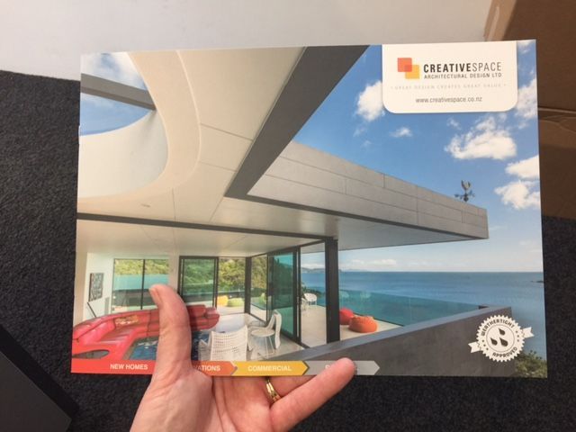
Sales and marketing people alike love having a high quality company profile brochure to leave with prospective customers or send with a proposal.
Not only is it a reminder of your meeting but it also provides a tangible snapshot of who you are and what you do. The customer can always find out more about your business via your website but we find there is still real value in having this printed collateral to support your business development activities.
Website vs Brochure
Your website is the showroom to your business. It's the place people come to find out anything and everything they could possibly want to know about who you are and what you do - your products or services, associated information, process, booking/ordering/purchasing, and so the list goes on.
Your company profile brochure, on the other hand, is quick summary of the main points you want to communicate such as your value proposition, key messages (why choose you) and a short overview of your products/services.
Getting Your Brochure Right - Write
Don't get caught out by thinking you have to fill all those pages with words, words and more words! Less is most definitely more in this case.
Instead let the space, images, illustrations and creative do the most of the "talking" here.
Think of your company profile brochure as largely a branding exercise where your prospective customer has just dipped their toes into your sales/marketing funnel. They're really not ready for all your blah blah so hold back and save that info for your website or next business meeting.
Layout Plan
Much like your website site map, you want to break your content into the top level menu = pages. This will then allow you to work out your information flow.
Now you can shuffle up the order to make sure the flow makes sense - tell your story from start to finish. It really needs to make sense because if it doesn't then you may as well not have a brochure, or your brochure could do more harm to your business than good!
Great Creative
We can't stress this enough. Make sure you have a good creative partner on board (ideally that person/agency looks after all your branding and graphic design work), and brief them with your layout plan plus make sure you are clear on the purpose of this brochure and target audience.
They can provide you with a design proof, and possibly help with the content too.
Quality Printing Matters
Once you've got your final artwork ready then you can take a look at your print options - sometimes you might want to look at this earlier, especially if you are considering different folding options or extras like a document and business card holder in the back.
It really is worth spending a bit extra, or reducing your print quantity to maximimise your print quality at this point.
Print specifications that will really help to lift your brand, the impression your brochure makes and the overall quality of your brochure can include:
- Paper stock - ask to see some samples, consider using recycled stock, maybe have a card cover and lighter weight inside pages, it's worth looking at options here.
- Embossing - a beautiful technique to make your logo, graphics or images literally punch out of the paper, giving an extra textural element to your brochure.
- Laminating - you can go from a full laminated cover to spot laminating just your logo, specific words or key elements on a page to draw attention to them.
- Cut-Outs - you can cut shapes into a page (like your business name or a word - "WOW") or you can trim corners or create page tabs, for example.
And that's just for starters! These are the sort of ideas you and/or your creative partner can discuss with your printer to make your brochure more memorable and valued than your competitors'.
Contact us if you would like help with planning, writing and/or organising your company profile brochure.

If you're going to all that time, effort and expense to produce a company profile brochure then don't take a short-cut at the final step by cutting costs with your printing! Instead keep your print run small and go for quality printing on beautiful stock plus think about those special extras that will really make your brand stand out - like embossing, laminating, cut-outs, etc.
